
How to use tone of voice in tiny ways to delight your customers
Sometimes, you need to set aside or at least tone down your brand voice for the sake of politeness, decency or not sending your customers into a rage-induced meltdown.
But today, I want to talk about the opposite. Those little, sometimes hidden, opportunities to sprinkle your brand voice like hundreds and thousands on your ice cream. First, I’ll share some real-life examples. Then I’ll tell you how you can find your own opportunities to make your customer experience just that little bit more memorable and special.
Not gremlins or goblins
Apple is the OG when it comes to premium quality with an every-person feel. Their mission statement sums it up perfectly: “Bringing the best user experience to its customers through innovative hardware, software and services”.
It’s a stroke of word wizardry then, that their in-store staff are given the lofty title of Apple Genius. Not Apple Gremlin or Apple Goblin; too-low brow, too whimsical. But equally not Apple Boffin or Maestro. Too exclusive, too nerdy. Genius encapsulates that premium quality feel while still being a commonly used word (“That’s genius!”) everyone will understand.
Arriving home to roost
When I got my Roost laptop stand in the post, it came with this little slip of paper. Not only did it guide me to the online instructions, it gave me a little slice of their brand values and voice. Roost stands for innovation, precision, design and simplicity. All of which is summed up in this smart little piece of word play. I like.

Re-form-ation
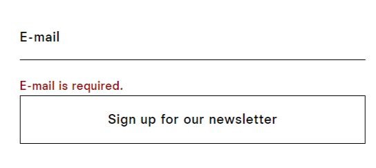
If you have forms on your website, they’re a great opportunity to share more of your personality. I like this one from Reformation. “It seems like you’re new here” sets the sardonic, edgy but in the end likeable tone the brand is famous for.

They could go one step further by replacing those “Email is required” error messages with something more personable like: “We need your email address”.
Filling the gaps
I admire yoga and fitness app Down Dog’s efforts to cram tone of voice into every nook and cranny. While you’re waiting for your class to load, the screen offers quirky little phrases like “Massaging Kale” and “Contemplating Man Bun”. My only gripe? They’re in title case.

A 212 about 404s
There are loads of creative 404 examples out there to soothe and entertain lost web users. There’s really no excuse for a toneless 404 at this stage. It doesn’t have to be the cleverest or the funniest; tidying queen Marie Kondo has: “We’ve been tidying up – and we let go of this page with gratitude”. Or Headspace: “You’ve found a page that doesn’t exist. Breathe in, and on the out breath, go back and try again”.
I also really like Mailchimp’s “We lost this page. We searched high and low but couldn’t find what you’re looking for. Let’s find a better place for you to go”. It is the perfect embodiment of their brand voice: plainspoken, genuine, demystifying. Interestingly, they leave out their fourth personality pillar: dry humour. Perhaps knowing their customer might not be in the mood for laughs when they’re lost in web-space.
So, how can you get in on the action? Let’s think about where you could inject tone of voice into your customer experience.
Picture your customer’s whole journey. Identify any opportunities for a little character. (Think loading pages, product descriptions, the more tiny and obscure the more surprising and memorable.)
If you have an IRL presence in your business, how could you tie that in with your brand’s mission statement and values? (Think Apple Genius.)
What do your customers see when things go wrong? How could you add appropriate personality to error messages and apologies?
Are there any little touches that would make your product packaging more interesting?
Can you add a bit of personality to your forms while making sure they’re still clear and user-friendly?
But don’t forget, in the words of Mailchimp: “It’s always more important to be clear than entertaining”.
Want to chat about what you’ve read? You’ll find me on LinkedIn. Or drop me an email to talk about your tone of voice or how to sprinkle it over your customers’ experience.